Brand identity
Hoyals
A refined and strategic brand for Hoyals, combining minimalist aesthetics with business insight to support meaningful growth.
About the project
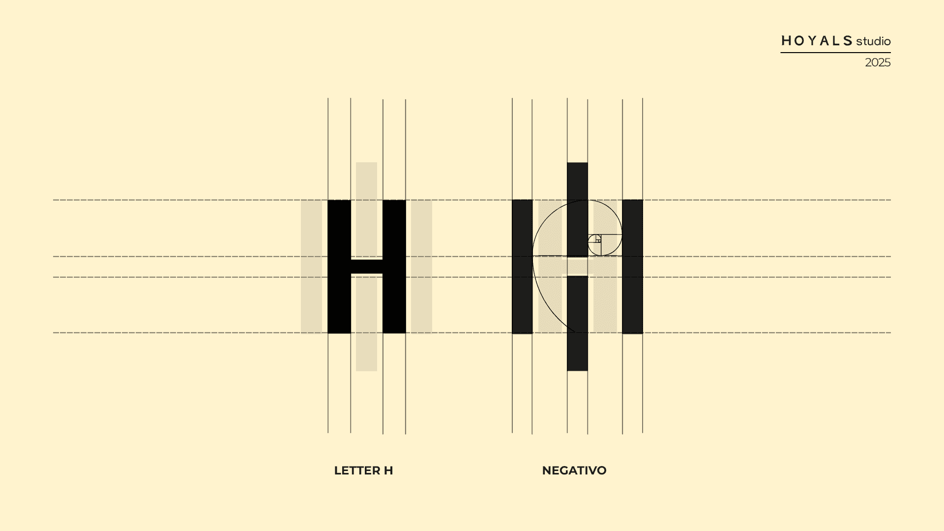
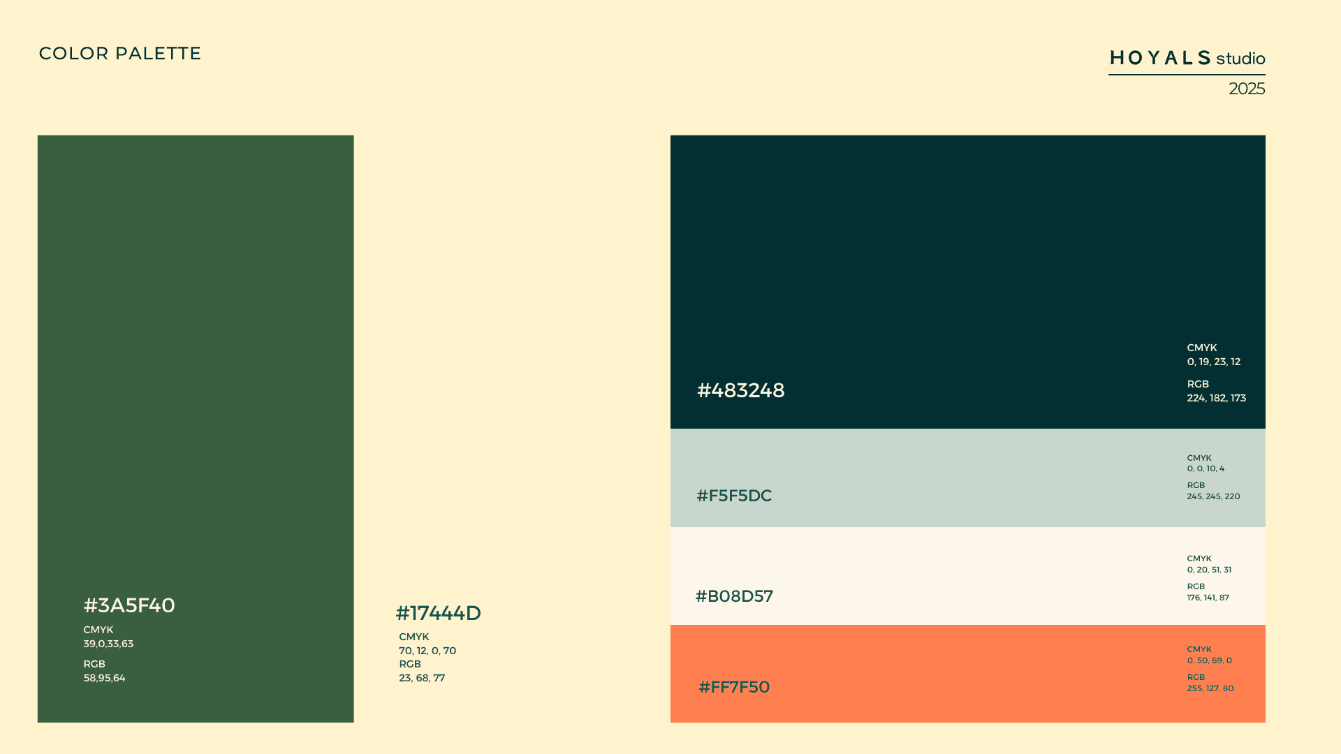
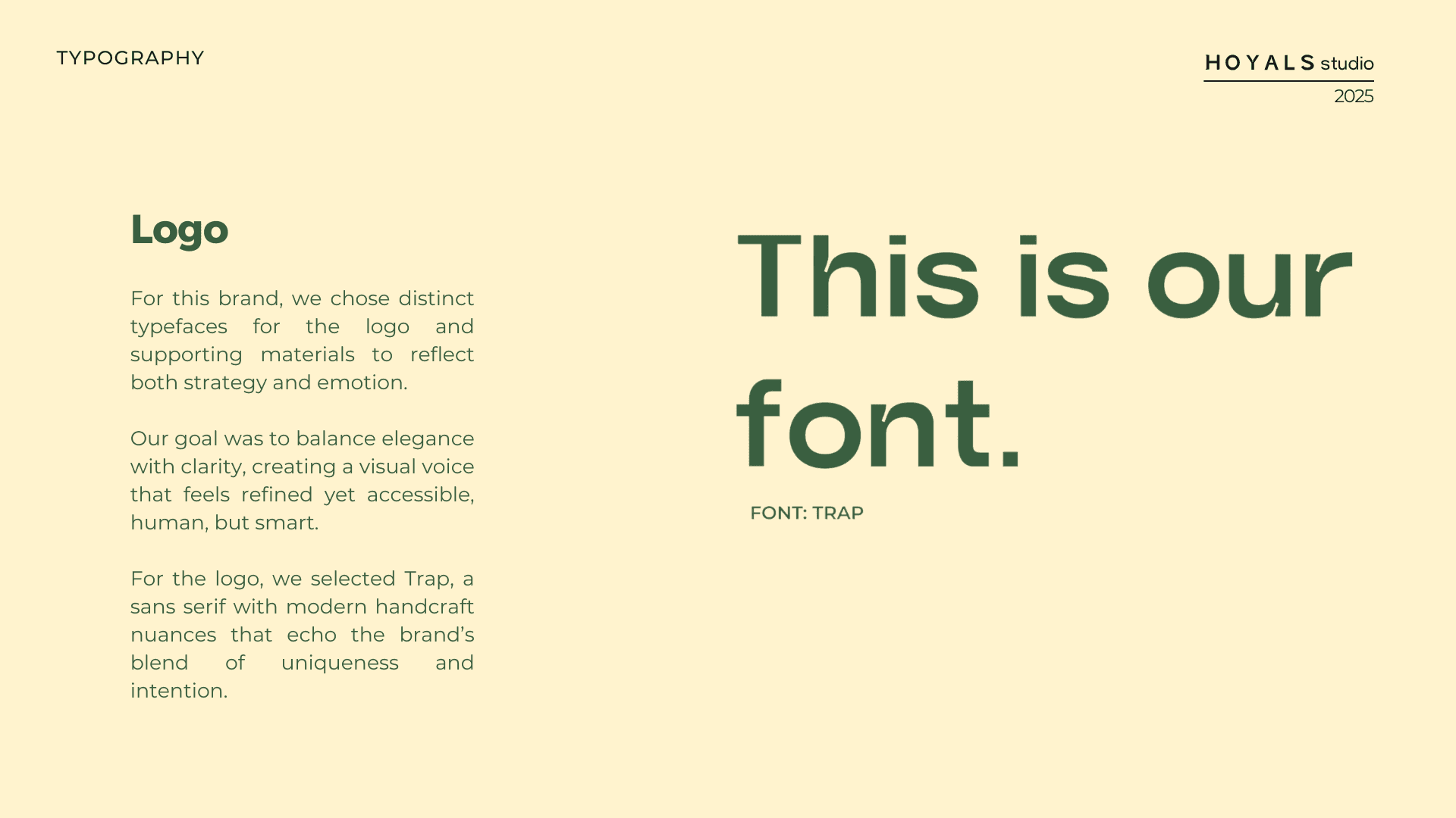
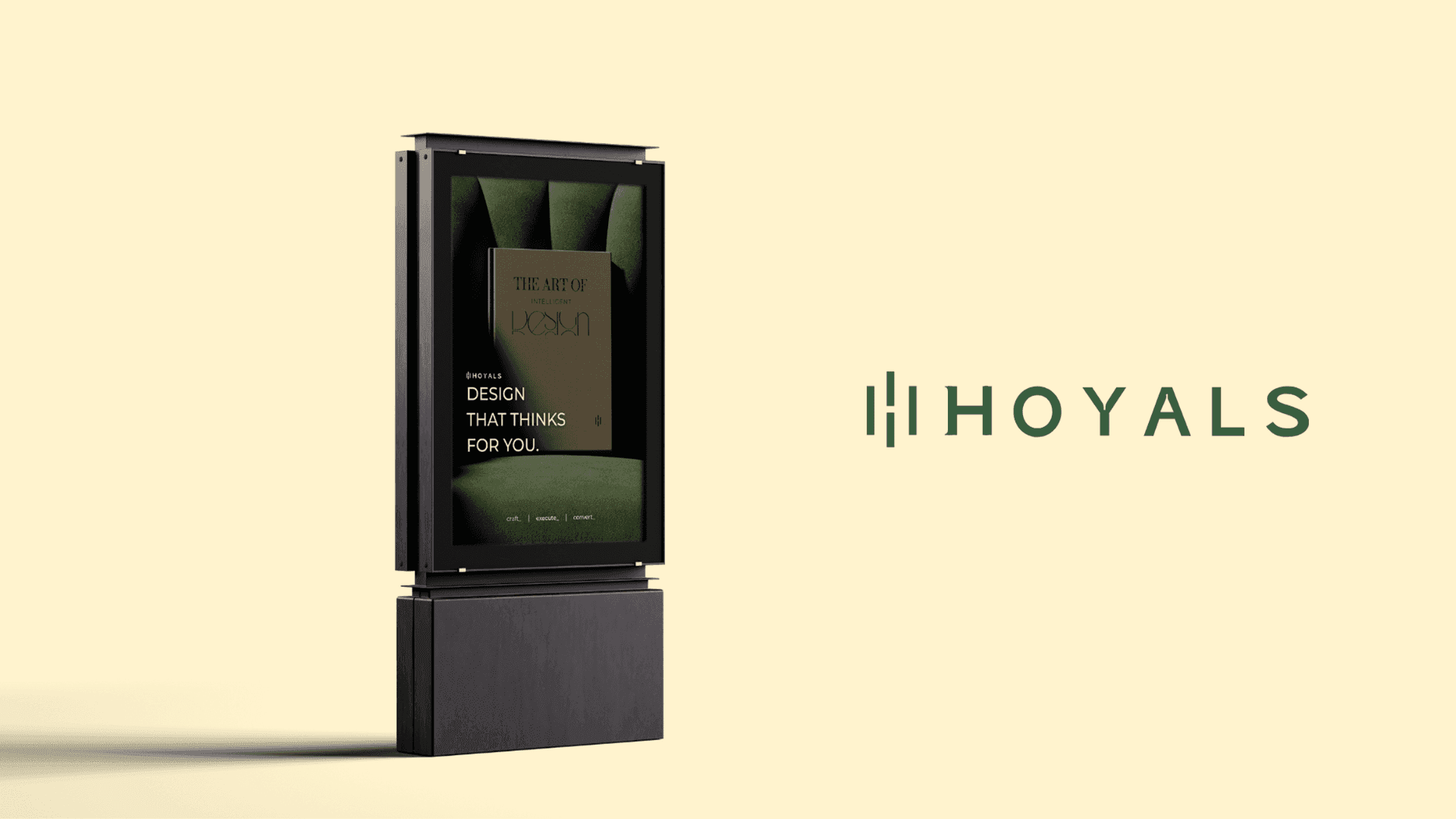
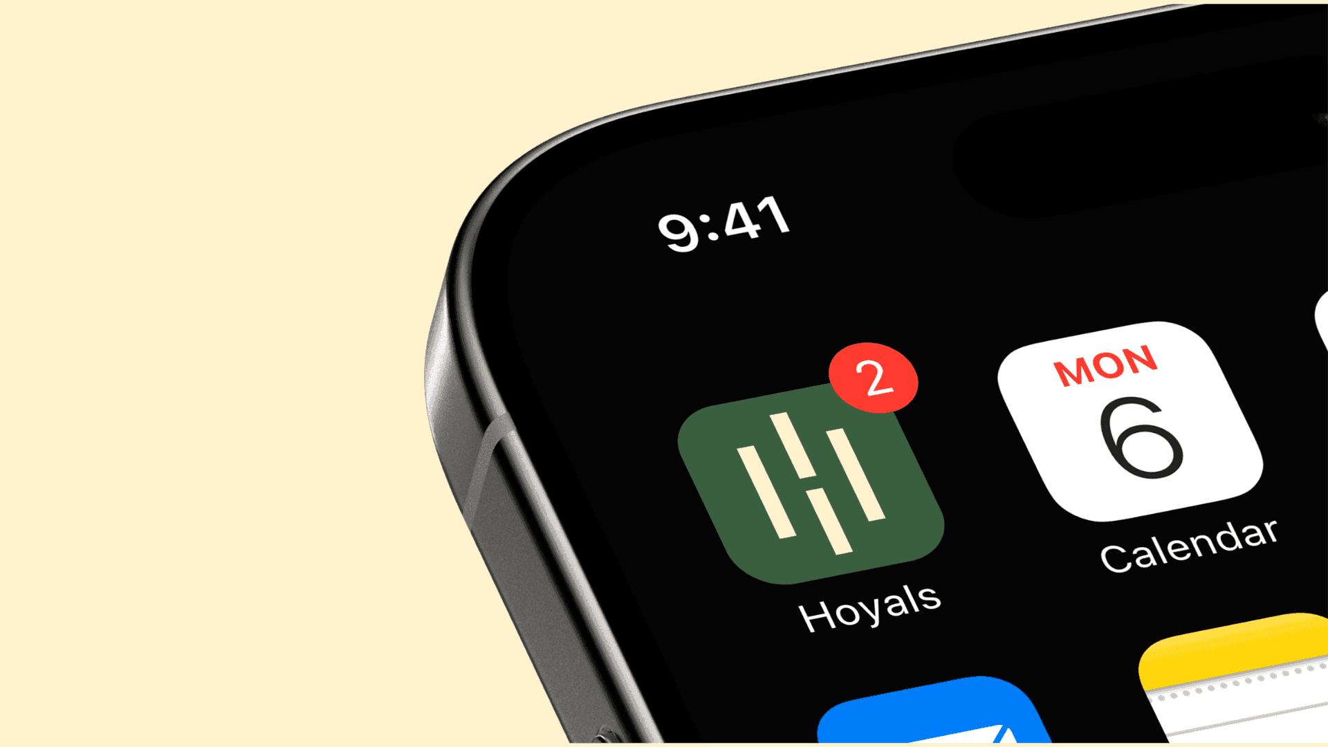
Hoyals bridges design and business. The identity needed to feel calm, precise and human, equally at home on a proposal, a social media post or a business card. The symbol is drawn from the negative space of the letter H, and the logotype is set in Trap, a sans serif with modern handcrafted nuances. Deep forest green leads the palette, supported by petroleum, sage, a warm off-white and a touch of coral.
Scope
- Logo and symbol
- Colour palette
- Typography
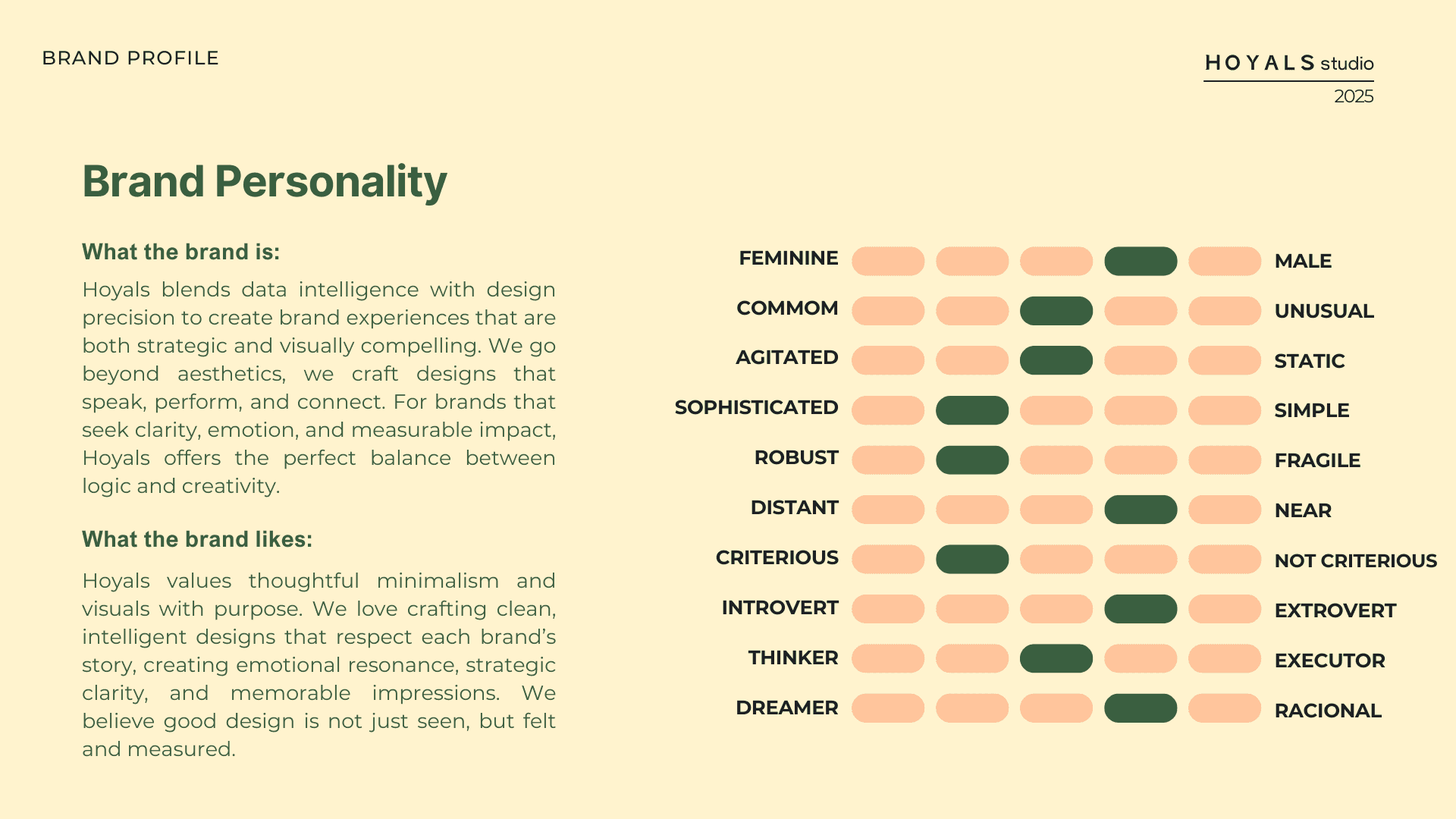
- Brand personality
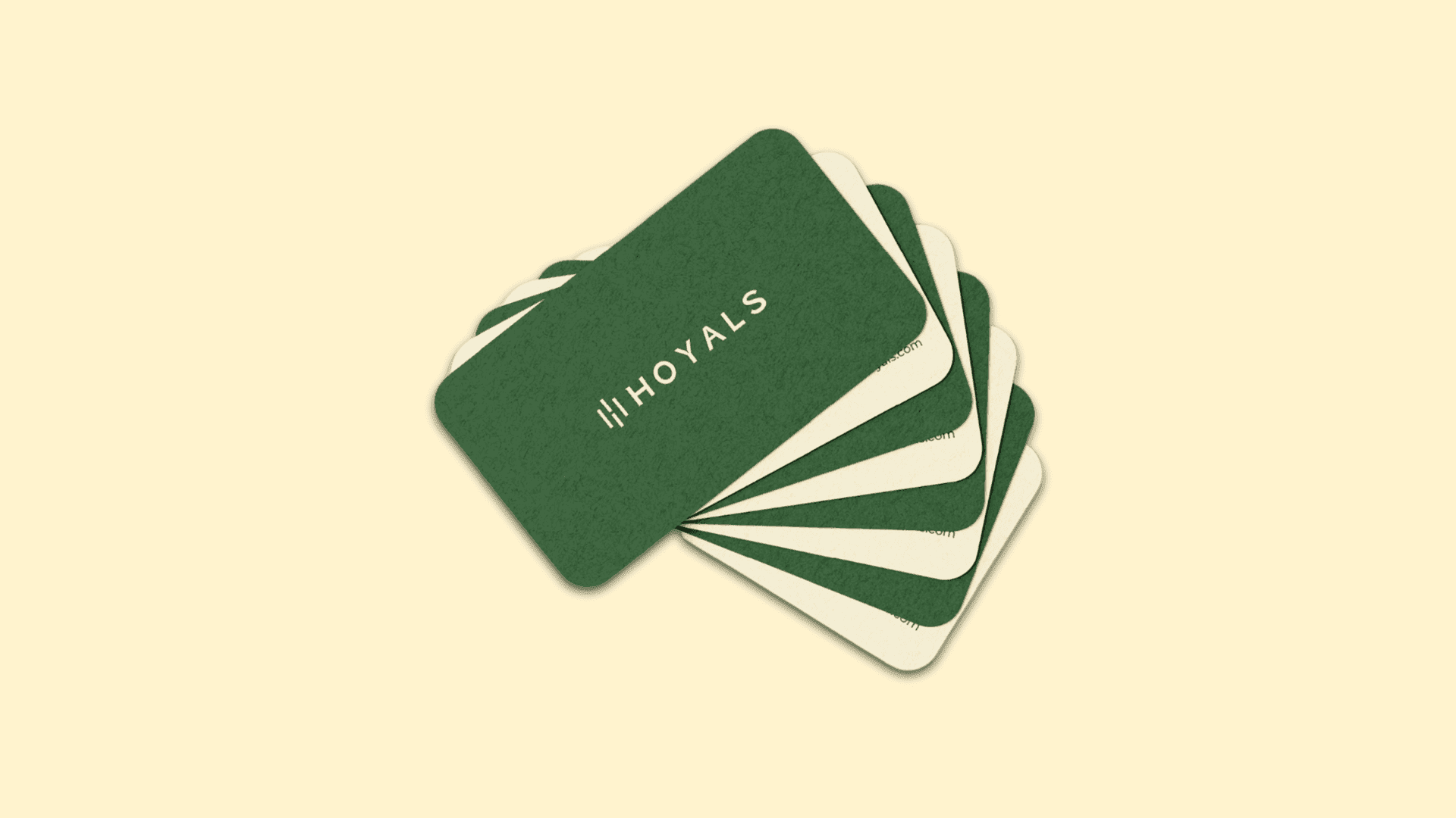
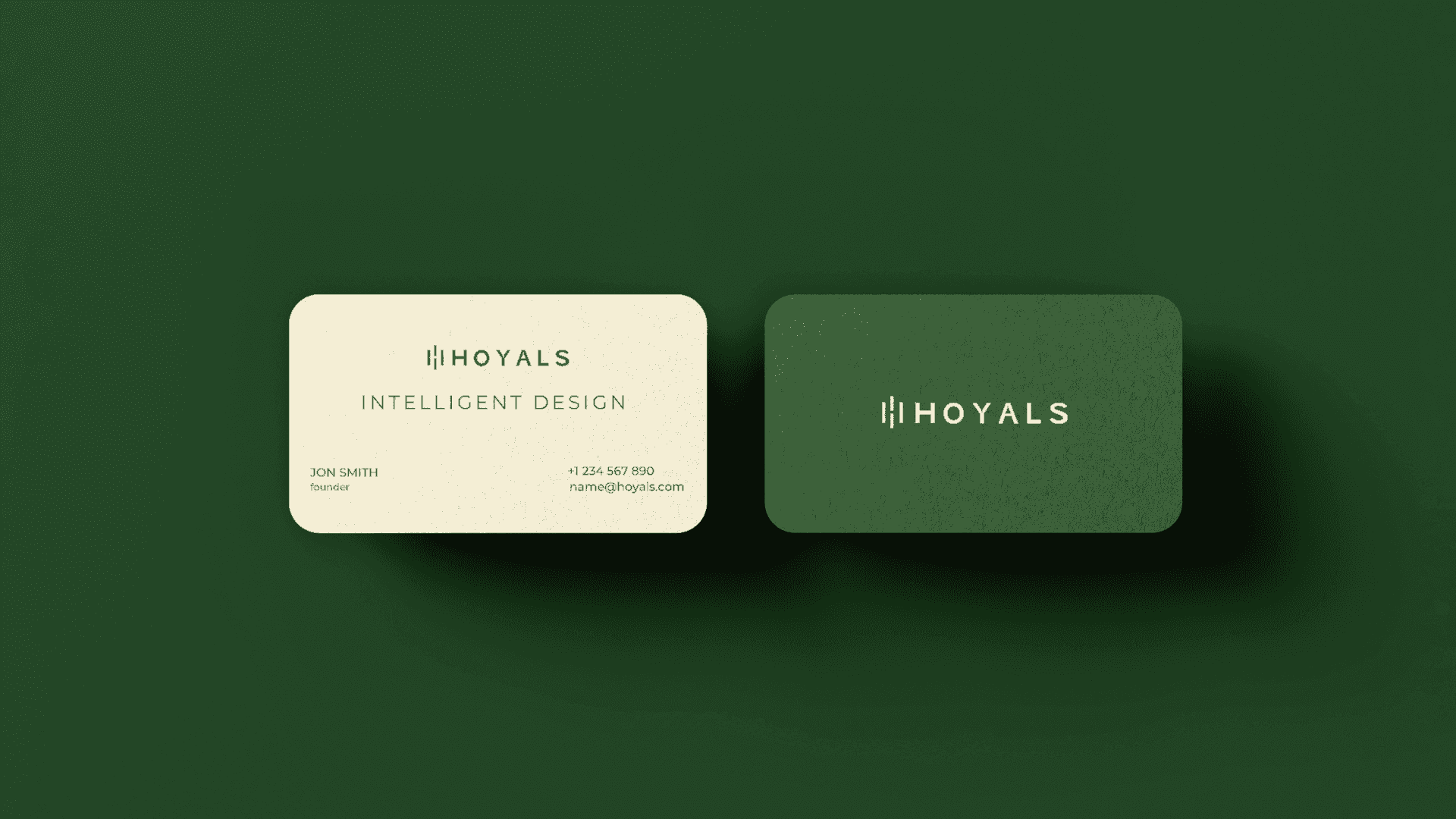
- Stationery
- Brand applications
Year2025
Gallery
The approach
Design is treated as a strategic tool. The visual language favours clarity over excess and elegance over decoration, and every element has a purpose. Grounded in visual psychology, the identity is built to communicate clearly, stay consistent across every application and grow with the business.
